Sunday, 9 November 2008

Obama campaign


I read a good article in the Guardian recently about the contrasting marketing methods employed by McCain and Obama. The conclusion was drawn that the Obama campaign was far more savvy in the way it was run. A great example is shown here, where "home made" banners were handed out by the Obama campaign team to members of the audience at one of the rallies to really emphaisise the 'grass roots' support he had.

Wednesday, 29 October 2008

Peepshow Collective website


Peepshow Collective is, unsurprisingly a collective of people working in varying aspects of the creative industries. They attract some seriously high-end clients and there work is incredibly diverse. I am very fond of the work they produce but I am even more attracted to their website, which with its simple navigation and endearingly quaint visuals showcases their talents beautifully.
http://www.peepshow.org.uk/

MORE 4


As brand extension becomes increasingly more popular within television I think it is important to look at how to get it just right. The brand identity for More 4 designed by spin is a clever mark that opens up huge possibilities for idents etc, which they have subsequently capitalised on. The tone of voice is always spot on as is the channel itself. A great example of successful branding.

William Murray Hamm website


I really like this website mainly because of the simplicity of the concept of 'before and after' showcasing some of their finest award wining work in a clever flash video. A few of the sounds are a little annoying but this can certainly be forgiven. A great example of a top agency's website.

Pinar Yolacan's portraits


Yolacan's exhibition Body of Flesh challenges our ideas about what is acceptable, right, shocking and humiliating. This is certainly meant to shock and it does just that. The images stay with you and challenge the idea that these images are revolting with the portrait subjects appearing stoic. Mesmerising and questioning imagery form Yolacan.

MUTO


MUTO a wall-painted animation by BLU from blu on Vimeo.
This new ambiguous animation by Blu is spellbinding with the movement and transition between locations flowing effortlessly. The scale and depth of the animation is awe inspiring and the content, as bizarre as it is, is great to watch. Thoroughly enjoyable artwork.

Barclaycard advert


There has been a great deal of talk about this advert. It is a very impressive spectacle and relates well to its target audience.

Visual Creativity by Mario Pricken


This book is a great resource for inspired advertising ideas. I have picked just a few of the solutions that I found particularly interesting. There are also some informative and insightful interviews with leading professionals in various areas.

Tuesday, 28 October 2008

Peter Fuss on Barack


An obvious talking point I know but Fuss plays on our fears, concerns and cynisicm in a worrying artwork that is an eerie prediction for the future.

Walls adverts


There are a number of these adverts with varying degrees of success but I really like this particular advert. It is a very simple concept but communicates the message with humour in a successful way that resonates.

The Warriors


I recently had the pleasure of watching this epic film based around gang warfare in NYC. It has become a cult classic and is a fun film that is packed with action and some great one-liners. The scale of the film is also very impressive.

THINK!


As ever the THINK! campaign communicates their message perfectly. A slightly different tack is employed by This Is Real Art than their usual shock tactics but again succinctly and cleverly conveys a vital message.

Bjarke Ingels Group (BIG) – Scala


BIG is based in Copenhagen and operates primarily in the fields of urbanism, architecture, and research and development. They try to create a synergy between sound creative design ideals and the functional aspects of design that must be adhered to for a successful build. This said their projects are always extremely innovative and produce stunning results.
The example I chose to highlight is the Scala Library, conference centre and hotel complex that is currently still in development. The building is a reinterpretation of the Copenhagan tower and tries to combine a solid base that relates to the size of the surrounding buildings, with a slim tower that becomes part of the skyline. The base and tower are morphed together in a spiral shape cascade of stairs leading to a public rooftop overlooking the city hall square. The design is unique and blurs the divide between inside and outside spaces.
There are many more examples of BIGs work on their website, which is aptly named http://www.big.dk

Logo Design by Julius Weidemann


This book is packed with inspirational logo designs sorted in a clear and manageable way. It also has some really helpful case studies that give a great insight into the conceptual and design stages the top agencies go through.

Remembrance Sunday/Poppy day appeal


The same heart-warming visuals have been employed this year on the Remembrance Sunday ad campaign. I personally feel the subject is dealt with sensitively and works as an effective call to action as well as generally creating awareness.

Ken Yeang-Menara Mesiniaga


The Menara Mesiniaga building is the seminal work of Ken Yeang whose Bioclimatic Architecture is part of the new wave of sustainable architecture.Yeang wrote of his philosophy, "In practice, architectural design is a craft, and a variable one at that. Post modernism has successfully shown up the volatile nature of this craft by its unrestrained use of architectural symbolisms, its frivolous multiplication of the surface area of the built envelope, its prodigious use of unnecessary building materials, its indifference to engineering economy, its extravagant use of land, and its irrational subservience to whim and history instead of the allocation and restriction of excessive consumption of energy resources."
Yeang continues to produce pioneering work executing theses design principles.

Pukkelpop festival website


The great illustration and ease of navigation are second only to the flash animation on this fantastically creative website for a large Belgian festival. The balance between content/function and form has been a great success in my opinion and everything that needs to be communicated is done so in a fun way that will capture the attention of any prospective festival goer.
http://pukkelpop.be/

Connect Sheffield


The new wayfinding system in Sheffield city centre integrates the pedestrian and transportation information for the city in an effective and concise manner. It also boasts its own typeface, Sheffield Sans, and is a stylish addition to the city centre environment. The project was a joint venture between City ID and Pearson Lloyd and has been carried out with great skill and knowledge of what was required. A great project beautifully executed.

Monday, 27 October 2008

Glenn Murcutt


Murcutt is an introverted Australian architect who works on his own in an isolated environment in a semi-detached house in a suburb of Sydney. He only works on buildings in Australia and yet recently began to receive worldwide acclaim. The reason for this is his ability to create innovative, environmentally friendly, practical designs. His modernist influences are certainly apparent, but it is his ability to really harness the strengths of the environment around him that is his most admirable quality. For example, the Marie Short House, which he began in 1974 is a brilliant example of Murcutt borrowing inspiration from his native home and history. He harnessed the form and materials of the woolsheds that punctuate the New South Wales countryside, taking advantage of their long and narrow shape and raised structure, which take advantage of the sun, rain and wind. The Marie Short House is just one example of his innovative architecture that has resonated throughout the architectural community.

Banksy


Wall and piece is the ultimate in coffee table books and I was fortunate enough to receive a copy recently. Full of wit and charm the book really conveys the irreverence of Banksy's work perfectly showcasing a selection of his finest works. My personal favorites are in the art section, where he secretly displays pieces of his 'art' in galleries and sees how long it takes for them to be taken down.

Monday, 20 October 2008

Ark


Grzegorz Jonkajty's short film, Ark, showcases the incredible talent of not just Jonkajty, but all of the people who worked to produce this wonderful short peice of film. I really enjoyed it and the detailing is visually stunning. For a great quality version go to...
http://www.3dluvr.com/jonkajtys/ark/arksd.html

Thursday, 16 October 2008

Victoria is changing


To illustrate the fact Victoria is changing Hat Trick Design implemented a total of 2000 recycled windmills, which were screwed on to a billboard space in Palace Street, Victoria, spelling out the word 'change'. The concept and execution were emphatically on brief and created a talking point for visitors and locals alike, generating awareness and intrigue.

Labyrint: interactive performance through body navigation


Body Navigation by Recoil Performance Group from ole kristensen on Vimeo.
Having recently been to a modern ballet performance I was intruiged when I stumbled upon this. It is a modern dance performance which is part of an installment called Labyrint, part of the Kaleidoskop K2 in Denmark. The performance employs the use of infrared tracking and video projection to give the performance another dimension.

Royal Mail stamp commemorating the Battle of the Somme


Hat Trick Design were recruited to design this commemorative stamp for the Battle of the Somme in 1916. The contrast between war and peace is reflected in the powerful imagery of barbed wire and poppies. It is an effective peice of communication dealt with sensitively and skillfully.

REX


REX is an architecture company based in New York. It has been responsible for the creation of some very bold and contemparary buildings and this particular building, the Seattle Public Library, is exemplary of the kind of work they produce. I really like their knowledge and fearlessness when it comes to the choice of materials and their designs in general.

Ryan McGinley


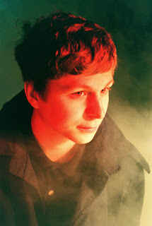
I really like Ryan McGinley's photgraphic style. He is quite experimental with his methods and style, often creating extremely atmospheric portraits.

Paul Davis' website


Paul davis is a substantial figure within the design and illustration field and his online presence until recently did not reflect this. Therefore, he recuited Applied Information Group to create a website that is fun, interacitve and reflects his online personality. The resulting website is a quirky website where there is nothing, not even the navigation, that is not a product of Paul Davis' artwork. The navigation is particularly impressive and must have required some very impressive work on behalf of Applied Information Group to make it operational. This website is a very good example of a website reflecting its content and can be accessed by going to http://www.copyrightdavis.com/

Homebase own brand paint


Homebase's packaging design for these tins of wall paint are simple and effective. It is great to see real creative thinking in something that could be perceived as mundane and staid. The generous area that the colour and finish are displayed on against the black of the tin means the consumer has a far better idea of what they are getting and shows the creatives employed here are also pragmatic, which is great to see.

The Reichstag


Architectuarly this building is a great example of combining modern and classical design. The renovation that took place in the late ninetees, led by Norman Foster, is meant to mirror the transparency of democracy. This is achieved using a giant dome which lets a great deal of natural light into the Bundestag/Houses of Parliament housed below. It is also accessible to the public and can be walked up and down using a staircase that elevates around the sides of the dome. I personally feel it is a fantastic project that is sensitive to the historic building already in place, combining classical and contempary in a very accomplished fashion.

As a sidenote, it is also of interest to mention the work of Christo in the mid ninetees in relation to the Reichstag. He and his wife undertook the gigantic project of wrapping the whole building in material. It took them 24 years to gain permision from the authorities to commence the project and took a great deal of time and effort. However, the resulting iconic imagery gave the German Parliament a great deal of positive press and tourism. Not just a peice of art but a fantastic exercise in PR by the German Government.